

Geospatial Data: Maps that Help Us Interpret Data
Maps as facilitators of data understanding
- Maps enable us to get the general picture at a glance in a way that is impossible with large tables of data.
- Check out the data maps available at Dataestur, with information about housing for tourism, employment and sustainability.
Spatial representation of data is possible through the combination of variables with geographical references. This transforms maps into the ideal containers for information on geographic context and to facilitate analysis and understanding.
The data associated with the geographic reference for a location on a map is known as geospatial data. Linking this information to other variables (mainly time and attributes) enables visual representation of the information through maps. This enables us to understand the number of tourists in an area, but if we have the coordinates for each area and we combine this with time information, the numerical data can be transformed on the map into a visual representation that facilitates comparison of tourist numbers in each area and how these are changing.
Geographical Information Systems (GIS) combine geospatial data and represent it on a map or in a three-dimensional scenario to facilitate the interpretation of relationships and enable identification of potential patterns and trends. This technology enables us to interact with the data using filters. Continuing our example, if we connect the tourist attractions we have geolocated with the interests of tourists (cultural, sun and beach, sports, nature, etc.) and we have the nationalities of the visitors, we could represent this on a map and spot possible patterns of interests based on nationality and how this relates to the time of year.
Maps act as geographic containers for data layers. Their simplest use would be to show coordinates using visual elements such as points, lines or shapes (known as vector data). Going a step further, we can use pixel map images (for example, colour scales) to represent the data spatially (known as raster). The most advanced use completes the geographic information system by interrelating layers of data, by superimposing a layer of tourist numbers and a layer of nationalities over the tourism areas, for example. The locations can be static (locations of tourist attractions) or dynamic (if tourist movements are available).
In summary, data mapping has some major benefits:
- It provides geographic context by correlating descriptive data with the physical place.
- It makes large volumes of information accessible at a glance.
- It facilitates analysis, understanding and interpretation of data.
- It simplifies comparisons of areas and identification of trends.
- It multiplies monitoring possibilities.
Here are two useful links for getting a geospatial information system up and running:
- Spanish Government Data Office spatial-data publication guide
- Spanish Government Data Office article on popular geospatial visualisation tools
Geographic Information Systems at Dataestur
Dataestur includes several interactive maps where you can check information related to housing for tourism, employment, sustainability data and Internet coverage.
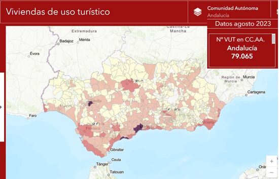
Geographic viewer of housing for tourism: the national map is highlighted according to the number of homes intended for tourist use in each municipality. In addition, it allows you to quickly analyse how these are distributed across each province or an autonomous region with the filters. Clicking on specific areas of a municipality will show other indicators of interest, such as the total available accommodation for tourists and the average price of accommodation. All information will include the corresponding changes and trends.

Interactive employment map: it shows data at the national level using a colour scale that enables identification of information on the largest numbers of new jobs or the best employability figures at a glance. You can browse the map for details of unemployment data, job seekers and employment contracts in each municipality.

Map of protected natural spaces: this map shows the protected natural spaces and those that are part of the Natura 2000 Network. You can also highlight on the map the proportion of protected area of each municipality using different colours or browse the selection to check the corresponding protected and forest areas.

Map of weather values: this map allows the user to browse the measuring stations to check information about the temperature, wind speed, rainfall, hours of sunshine and ultraviolet index, which will be shown on the dashboard. The data can be viewed by year and by autonomous region, province and municipality.

Air quality data map: shows a visual representation of how each air quality category is distributed each month in each municipality with measurement stations. For example, you can check the areas with the best air quality at a glance.

Map of water quality in bathing areas: it represents the values measured in the bathing areas, identifying the general quality of bathing waters on the chosen coastline. You can filter by autonomous region, province and municipality and select each sampling point to check the quality of water and specific details about the bathing area.

The broadband Internet coverage maps also represent the data using a colour scale, enabling us to identify quickly how broadband is distributed in general throughout Spain. The map also gives access to detailed information on each municipality and data on fibre coverage, speeds and the areas of action susceptible to receiving aid for the deployment of fixed broadband networks.

*The images shown on the maps may combine several screens to show different usage possibilities